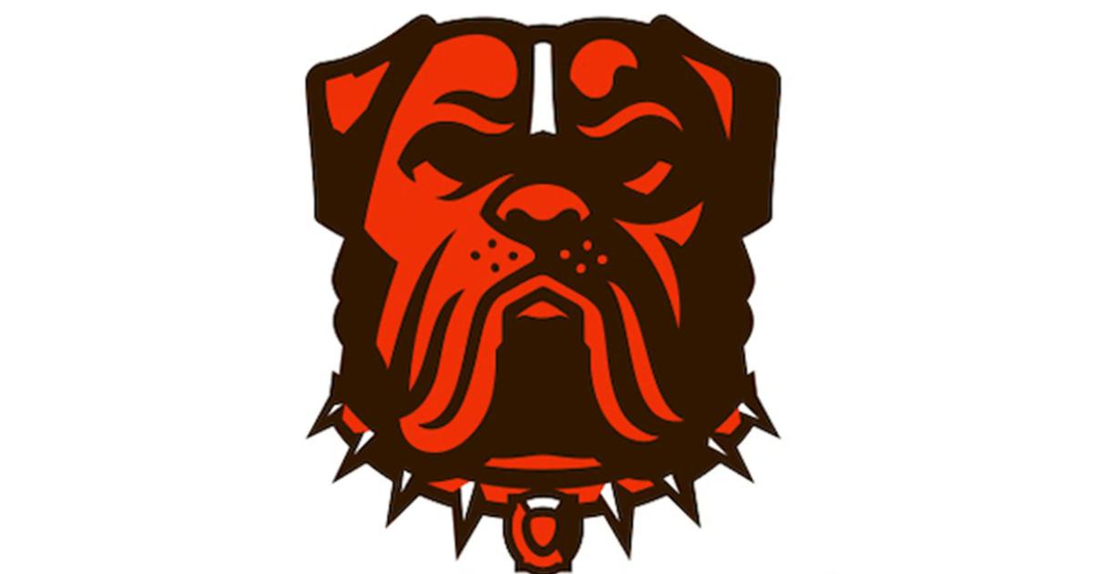
There’s a new dog in town.
The Cleveland Browns were on the hunt for a new dog logo and began a contest in April for graphic designers to create one. The contest received over 400 submissions.
Anyone who’s ever had a dog knows how difficult it is to pick just one, so the Browns let the fans decide.
MORE: Browns schedule 2023: Dates & times for all 17 games, strength of schedule, final record prediction
Fans spent the last few months barking on social media and debated which one would ultimately call Cleveland home, with the last two contenders receiving votes during the final round that ran from May 30 to June 9.
only a few more days to get your votes in…
🔗 to vote: https://t.co/RKgLbsJSMM pic.twitter.com/YvFQJk0f5Z
— Cleveland Browns (@Browns) June 6, 2023
On Monday, they announced the winner. Here is everything you need to know about the Browns’ new logo.
Cleveland Browns logo, explained
The winning design was created by Houston Mark, a designer based in Texas. He tried to highlight the city of Cleveland as well as capture the fanbase’s intensity and passion, as described in the Browns’ release.
He told the team about the design, “How can I make the Cleveland Browns fanbase the forefront of the design while also maintaining this aggressive, no-nonsense attitude?”
and the winner is…
Introducing our new official dog logo!! 🐾🎉 #DawgPound pic.twitter.com/zny6NxobHy
— Cleveland Browns (@Browns) June 12, 2023
The Browns executive vice president and partner JW Johnson said via Browns.com:
We are so excited to unveil a new dawg logo that perfectly encapsulates who we are as a franchise and as a city. Our fans have been asking us for a new dawg logo for quite some time, so it made perfect sense for them to select the logo themselves and decide how they want our team to be represented — and they made a great choice.
Mark, who didn’t miss it with the logo, took the time to thank everyone for their support on Twitter.
Thank you to everyone who voted! I am truly overwhelmed by the support given to me over the past two months, I can’t express the gratitude I have for the outpouring of positivity and appreciation given to my work. Cleveland, this is for you! https://t.co/pZg5q7U824
— Houston Mark (first name Houston) (@houstonnotmark) June 12, 2023
The logo might look like a dog on the surface, but the winning design captures much more than that — with a few treats hidden in plain sight.
more than meets the eye 🧐🦴 pic.twitter.com/iwJ7i1kN6a
— Cleveland Browns (@Browns) June 12, 2023
MORE: Browns’ Nick Chubb says he’s ‘playing for’ late Jim Brown in 2023
Here is how each of the symbols was described in the team’s release:
Ohio – The highlight in the top left corner of the mighty bullmastiff’s right ear is in the shape of Ohio, where the Browns have called home for over 75 years.
Football – The nose of the dog is in the shape of a football, as just like the Dawg Pound, the mascot has a nose for the game.
East Endzone – The outline of Cleveland Municipal Stadium makes up the design of the tag, paying homage to the city by forming a “C,” and the origin of the Dawg Pound with a highlighted East Endzone.
Guitar Pick – At the center of the tag lies a guitar pick as a nod to the Rock and Roll Hall of Fame.
Spikes – The collar features 8 spikes, evoking intensity in their form and tradition in number, with the Browns finishing champions 8 times in their history.
Guardian Bridge – Cleveland’s Hope Memorial Bridge makes up the space below the jowls, fortifying the bond between fans, team and city.
Pound Helmet – As another nod to the original 1980’s Dawg Pound, the iconic maskless helmet shell worn by Browns faithful at games is hidden in the top right highlight.
Helmet Stripe – As a nod to the iconic feature, the logo features a center stripe that adorns the classic Browns helmet.
The new logo will be used for merchandise, along with other team uses — indicating it is more of an alternate. The new dog joins Brownie the Elf and the team’s iconic helmet as other logos used by Cleveland’s football team.
Because it was born as the NFL’s dog days of summer begin, fans of the Browns will have to wait until the season kicks off to unleash its new identity.


